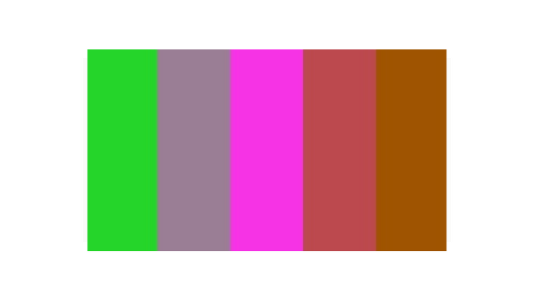
An Unpleasant Colour Palette
Share
My friend SamBeAwesome recently posted a gorgeous piece of art...
I gave the "unpleasant palette" (via color-palettes on Tumblr) a try after seeing @TheSourSavior attempt it xD This was way too fun haha#digitalsketch #digitalart #artistsontwitter pic.twitter.com/uXMUuB1RHB
— Sam (@sambeawesome) November 6, 2024
...and because I'm a sucker for an art challenge, I hunted down the palette.

I started off trying to do a traditional art piece. I got out my book of alcohol marker swatches, and had pens to match the neon colours, but not the others. So I diverted from the project a bit and did a neon rainbow monster.

And then I went digital.
Normally when I do digital art I work in the CMYK colour profile that things are printed in. Ever since I first tried to print my digital art and got ridiculously disappointed. (For an explanation of CMYK vs RGB, go here.)
But this colour palette just wasn't going to work without RGB, so I used that. And it is bright!

I think I managed to make quite a cute monster - definitely not "unpleasant".
But, I can't turn that guy into a sticker because of aforementioned issues with printing RGB artwork.
So I recoloured the line art in CMYK and made a version to fit one of my collections.

What do you think? Which is your favourite version?
